|
|
|
Sorry if your monitor is too small for this; it just doesn't look right unless it's big.
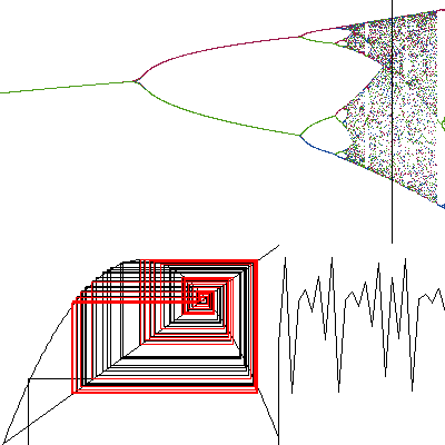 The bottom portion of the graph isolates one r value, or constant, and shows how the population is changing by generation for that value. In this case the constant being examined is 3.7. 3.7 is the black line on the upper graph. The bottom left graph shows how a population is settling. If the red lines spin in on one point, then the population is settling on one value. If the red lines form a rectangle, the population is oscillating between two values. If the red lines form two rectangles, the population is oscillating between four values. If the red lines seem to be all over the graph, the population is not following any pattern; it is what some would call chaotic. The bottom right portion of the graph is what Steven and I called a cardiograph. It shows how a population is rising and falling, much like how a heart is contracting and expanding. If the population is settling on one point, the graph will look a bit like a superball slowly bouncing down to the ground. If the graph is bouncing between two y values, the population is hopping between two values, and so on. In the case of this graph, the population is hopping between all sorts of different values. It may be of some interest to note that even when the population is behaving "chaotically", the upper graph is producing several sweeping curves out of the points. It takes a while to see these curves in the upper graph, but after a while one can't miss them. I don't think I can describe them, so you'll just have to look for yourself. The equation/sequence that created this graph is the simple equation for population, which can be found quite easily at most any chaos page. My apologies that I'm too lazy to rev-engineer the code to find out what it is. A good chaos page is listed in my Et Cetera pagelet. As to the code that created this graph, it was written by Steven Looke and I using a dialect of Lisp called Scheme. This project was part of a Lisp class we were taking during interim at the Kinkaid School. The compiler used is called MacGambit. Much thanks to Mr. Burnette, who taught us how to write the code, and who got me started on programming again. If you happen to interested in chaos theory, a good place to start would be Yahoo's Chaos section, or the book Chaos, by James Gleick. What I find most interesting about chaos theory is Michael Barnesly's fern. This fern was created by a random number generator and a few simple rules about where to put the points. I find it fascinating because I wonder if Nature uses the same algorithm to create it's own ferns, happily encoded in its DNA. Well, I've talked long enough. A picture of his fern is located at the web site listed in the Links pagelet. I'll be lazy and let you click your way there.
|